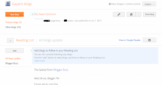
So what's new?
Well as promised, almost everything is new!. Although I was hoping for some new templates but I think that should also be arriving pretty soon too. Anyhow when you log-in to the draft, at first it can be rather confusing. So I waited for few minutes and you know click here and there, etc because I didn't want to write an article just out of excitements.
 |
| You can hide chosen Blogs by clicking on that "arrow" easily... and get the usual menu of "status, layout, etc" by clicking on the down-arrow next to the "home" icon as well... |
Once you get used to it a bit the thing that I realized was, how efficient is the new GUI. For instance, from you draft page which is the "home page" for your Blogger account, now Blogger shows you things like...
*. Page views (although the "old" things like how many articles you've published are still there but I'm just trying to drag-out the new stuff), nothing advanced but this lets you get a basic idea of you current traffic status and when you click on the it it'll take you directly into the more advanced "page views" page.
*. A new Layout editor GUI - Well the only noticeable thing is the colors and adding Gadgets, etc.
 |
| As mentioned, nothing major, except for the left-side "options" which were used to sit on top of the page and the colors ;-).. |
*. The "Earnings Tab" by using which you can check the Adsense and other Google Supported affiliate networks (such as Amazon, etc) still uses the old interface but there's a message saying that it'll also be available pretty soon nonetheless.
*. Post Editor - This is actually another thing that has gone through some major changes. For instance, as said before, the noticeable thing is how efficient the new interface at using your valuable display screen pixels. Unlike in the past where the post editor used to have "Labels, Location, Schedule", etc to the below section to the window, now we have them to our right side.
One thing though, I'd like to have an option to view my current blog as with the old interface from the Post-editor which is not available in the new GUI :/
 |
| A heavily refreshed area and the options are now displayed to the right-side of the screen like in WordPress |
When you type something in the "Labels" window now the pop-up (with the automatic suggestion) pulls down the list rather than horizontally which is again makes things more easier + one annoying thing in the past while I was adding a label was that say that I typed the word "learn" and there was an automatic suggestion called "learn linux" which is not the suggestion that I was waiting for, then I had to use the "space" key to add a bit more to the label then Blogger would automatically insert the previously suggested (which is not what I wanted) one.
 |
| Excellent adding Labels support (less annoying)... |
But with the new interface, nothing crazy like that happens if I press the space key to add more words to the Label which is a big relief. And also unlike in the past where whenever I opened the post-editor in Blogger, I did feel some "heaviness" of my mouse (don't know how else to put it) which usually occurs when the Web browser takes reasonable amounts of system resources but with the new Post editor, things feel so much lighter!. I guess now it's optimized and perhaps a bit kind on our computer hardware too.
Now you cannot scroll the post-editor window using the web-browser's original scroll-bars. Thus as you go deeper into the post, then you'll have to look below where in the past we could just scroll the page using the standard browser scrollbars thus bring the written post/text to the middle section of the post-editor which is a big comfort for the neck and the eyes. So, hopefully they'll fix it as well.
*. Image Uploading - This haven't changed since it was one of the first things that Blogger introduce of this new GUI like almost two months ago if I remember correctly.
Anyhow this is just a very few of the main features to mention but in general if you're familiar with the WordPress platform, well I gotta say, especially the post editor, the new Blogger interface looks a lot like WordPress where the GUI and other elements are arranged to your side rather the bottom
BUT: - If you have like a bit lower resolution display screen (below 1024x768) then unlike in the past where the Blogger draft GUI was optimized for 800x600 type screens, now you'll find the new GUI quite annoying and not fitting nicely with your resolution.
 |
| New Template selector... |
But then again I guess that perhaps Blogger did some research and found out that most Bloggers now have high-res (HD probably) screen thus thought it's about time to optimize for that. Anyhow I'd like to take this opportunity to congratulate the Blogger developer team this awesome interface. So thank you and as users if you have suggestions, then make sure to report feedback to the developers too.


0 comments:
Post a Comment